
10 Web Design Trends For 2023 To Enhance Your Customer Experience
Julian Wallis
16 min read
In the beautiful world of technology, constant change is the norm. Every day, an innovation or modern convenience seems to hit the market.
In the realm of website design, 2023 has a wealth of novel ideas for designers to experiment with. Put another way, the potential applications of a well-designed website are many. For this reason, businesses can only rely on an online presence to get the profound benefits of digital marketing.
Additionally, they should be up to date on the latest web design developments, including aesthetic trends and functional innovations. It will help companies optimise profits while also living up to the increasingly high expectations of their online customers in terms of usability, look and feel, and overall navigational experience.
It’s a race to incorporate the most excellent customer engagement methods, and tools since the continual delivery of a superb user experience has become one of the critical aims of every web design service agency worth their salt.
Today, we’ve compiled a list of the most anticipated web design trends for 2023 that will impact user experience and, therefore, online revenue. So, without any further ado, let’s get this list rolling!
Web Design Trend #1: Customer-Centric UX Design 🖼️
It goes without saying, but designing with your end-users in mind must be a given for the design to delight and please your target end-users. That’s why a customer-centric design strategy should be at the heart of everything you do with your website. Customer-centric design refers to the design process where you create your product or service offering solely to satisfy your ideal customers’ needs, wants and pain points.
Website design has gone a long way from being a primary database available to everybody to where customers expect a corporate website to have a certain level of contemporary design savviness in addition to UX fundamentals – usefulness, usability, credibility, and accessibility.
Put simply, the modern website visitor is searching for websites with:
- Super fast page load speeds because nothing speaks bad UX than slow performance
- Helpful chatbots that seem human
- Simplified and uncluttered page layout for ease of use and content consumption
- Responsive and adaptable design to ensure your website looks consistent across all devices
- Mobile-friendliness as mobile traffic is just as important as desktop traffic, if not more!
- Intuitive interfaces that portray UI/UX best practices
- Credible high-quality content and information presented in a visually appealing format
- Accessibility features to ensure all of your potential customers have a good browsing experience
These fundamental UX requirements provide customers with a more exciting and interactive digital experience. As an added bonus, this also provides a solid foundation for adapting to the latest developments in web design in the year 2023. If you haven’t already, there is no better time to start doing this with your website’s UX strategy.
🙋♂️ How To Implement A Customer-Centric UX Design Strategy
To help you initiate a customer-centric design philosophy in your website design process, we’ve compiled a list of the five golden UX design rules you need to focus on:
- Reinforce accountability within your organisation to provide excellent customer service will help you better understand your customers.
- Use customer feedback as your guiding light for product/website optimisation. Customer experience should be a critical factor in significant design decisions.
- Remember, usefulness (value proposition), and urgency (product/feature necessity) always trumps complexity and technical sophistication. Therefore, what you think is the best product may not be the best solution for your customer.
- Design is not just about creating something easy on the eye; solving problems for your customers is the true objective you ought to be striving for.
- Effective post-launch communication shouldn’t be overlooked if you want to truly build trust and authenticity with your customers.
Ultimately, in 2023 the concept of customer-centric website design will be a significant design trend as businesses realise that solving customers’ problems is the best way to deliver exceptional service.
Web Design Trend #2: Data Visualisation & Bespoke Graphics 📊
With data being generated at unprecedented rates in this day and age, companies must make better use of it. Otherwise, what’s the point, right? But telling a story with data is easier said than done. This is where data visualisation comes in. Data shouldn’t just be facts and figures; it can be presented interestingly, and in 2023 it will.
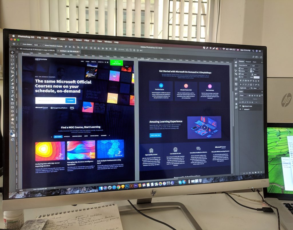
One thing you need to know about data visualisation when it comes to web design is that it isn’t just about showing information; it’s more about showing the patterns within that information in a clear, exciting and easy-to-understand format.
In the past, adding a few stock images here and there to break up the monotony of text was a simple way to freshen up a B2B website or a blog page. But, one of the cardinal sins of web design is using stock photos or other generic imagery. Unfortunately, this fad will no longer be successful as stock images are becoming obsolete because people are likelier to stick with companies that they feel are providing value and authenticity.
To live up to your consumers’ expectations, brands must establish genuine connections with them. One approach to get this message through is using high-quality pictures that accurately represent the qualities and values your brand stands for.
As a result, visitors to your site will get a sense of familiarity rather than imitation. Another option would be to use custom graphics. Despite being more expensive to produce consistently, they can set you apart in brand perception, service quality and customer satisfaction. The unique tone of voice that develops as a consequence inspires confidence in site visitors and shows them that the business takes customer service seriously.
The value of original images in explaining complicated products and services cannot be overstated. In addition, subtle aspects of brand culture and ideals may also be communicated with graphics and colour.
Web Design Trend #3: Immersive 3D Features 🎲
Technology advancements in programming free the imaginations of designers. Thus, The increasing number of people using artificial intelligence, virtual reality, and other modern technologies like the Metaverse will make it simpler to incorporate 3D design elements into the web design trends for 2023.
👥 What Are 3D & Pseudo 3D Web Design Elements?
3D design elements can include buttons, logos and occasionally text, and pseudo-3D features include soft shadows, layering, and floating effects that mimic depth, visuals and text. It’s important to note that these were not always so readily available previously.
3D and pseudo-3D graphics may improve the usability of interfaces. For instance, designers may make floating menus remain static without vanishing into the background even as the user traverses around the page. This gives them something to look at while they’re looking around online.
What’s more? There will most likely be a rise in fully immersive 3D websites. What’s the point of these types of websites, you may ask? Well, they’re pretty much a video game rolled into a website format. What’s not to like about that? Safe to say, they’ll keep your visitors engaged and help you provide a better browsing experience unlike anything they’ve most probably ever seen.
Here are two brilliant examples where you can see the wonderful world of 3D web design.
Visit: SBS Town’s Website
Visit: de Bijenkorf’s Website
This concept will undoubtedly be a favourite because of its ability to generate visual intrigue and build an immersive experience for users. By allowing users to engage with your website’s 3D and pseudo-3D features, you can keep them on your site for longer and help them navigate more easily.
If you’re a website owner, you’ll want this trend to be part of your designer’s toolkit since it can lower bounce rates and improve time spent on the page improving conversion possibilities.
Web Design Trend #4: White Space Used Effectively ⚪
Using white space effectively proves that less is actually more. White space is used in a minimalist or flat web design process to help readers readily identify text sections and their relative importance. The ability of white spaces to improve website load times and eliminate unnecessary visual clutter is well known. However, this idea could be more groundbreaking in terms of website design.
For some time, designers have opted for minimalistic and simplified approaches for their projects. However, there has been a recent rethinking of the minimalist ideal. The classic barebones websites may serve a specific purpose, but for the majority, a perfect blend of information layout and whitespace is mandatory for the design to work. This is why web designers are warming up to a rethink because shrewd use of white space may be used as a canvas to complement other developing styles.
This allows 2023’s designers to include more life in their designs. They will play with organic geometries like layering and overlapping pieces, 3D, pseudo minus 3D components, and more. These might initially feel overwhelming, but they are excellent for generating visual intrigue.
The amount of information that a user’s eyes can process at once is significantly governed by the clever use of white space in a flat design. White space used intelligently prevents consumers from being overwhelmed by visual info.
The layout should use the available area to provide the UX you envision. The goal is to smoothly transition the audience’s focus from one piece of information to the next without any distractions. This method may also be used to increase the impact of your visual narrative.
Web Design Trend #5: Parallax Scrolling 📜
You can expect more sites to use parallax and other forms of dynamic scrolling. In 2020, endlessly scrollable single pages with dynamic scrolling were all the rage since they reduced bounce rates. Parallax scrolling is the next logical step in this trend and improves the notion that web designers have popularised.
🚵♀️ What Is Parallax Scrolling?
The term parallax scrolling refers to a style of web design in which the backdrop moves at a slower rate than the foreground to provide the impression of depth and motion while yet being on a single page.
As the backdrop moves slower than the overlaying pictures and text visually, it’s akin to having a storyteller read the narrative to you as you scroll down the page. For this reason, the parallax scrolling effect should be used gently since it enhances the narrative possibilities of a backdrop picture. It’s best carried out with smooth transitions, well-timed events and a muted backdrop that focuses on the forefront components where they can best interest the user.
When the brand narrative is king in today’s market, interactive elements like parallax and dynamic scrolling may pique a user’s interest with no effort. But unfortunately, this trend also gives the impression of moving through different pages while only on a single-page website.
Web Design Trend #6: Gradients 🌈
The use of colour gradients to indicate mood is making a comeback. But, while minimalism will always have its place, designers have moved away from a sterile black-and-white colour scheme. Gradients will play a significant role in the future of design as designers of 2023 embrace a wide range of colour options.
Stripe: A fantastic example of background gradient done right!
The quest for additional visual narrative components is behind the trend towards more vibrant hues because of their associations with various emotions. Colours serve as a valuable resource for web designers who want to gradually use their sites’ aesthetics to arouse certain sensations in visitors. This affects how users behave and may also affect how they first perceive the site.
But, as with everything else, finding the perfect balance between too much and insufficient is vital when using gradients. And, in relation to best practices concerning implementing gradients, here’s a quick cheat sheet you can follow.
- Don’t mix too many colours. Stick to 2-3 as a standard.
- Use complimentary colours, and avoid clashing colours. Adobe Colour CC is a handy tool to help you in this regard.
- Determine a fixed light source to differentiate darker and lighter areas.
- Use linear gradients for square and radial gradients for round areas. Instagram’s logo applies this concept perfectly.
- Use different shapes for the fill and gradient colours.
- Experiment with opacity to allow the colour to blend into fill areas.
Web Design Trend #7: Asymmetrical Layouts & Fractured Grid Systems 🏙
Using asymmetrical layouts, fractured and split screen grid systems will shake up the predictability of current website designs. When designing a website, creating a hierarchy of visual elements is standard practice so that the site makes sense with minimal cognitive load for the visitor.
Using an invisible grid to organise the website’s components is a tried and true method for achieving this effect. When everything is neatly organised and in the correct order, it’s easy on the eyes.
In 2023, designers abandon the standard grid framework in favour of innovative site navigation and layout approaches. As a result, there will be a lot of emphasis on asymmetrical layouts, aggressive topography, bespoke imagery and organic forms in newly designed and redesigned websites. Also, designers will use split-screen functionality more often in the future.
As its name indicates, split-screen effects divide the screen into two halves to show distinct yet related carousel items. This technique of organising pieces has made the design popular on e-commerce websites.
Unlike these website-type categories, the 2023 trend is about disrupting established categorisation. The new split-screen design will either be asymmetrically divided or blur the line itself.
Those lines will be replaced with clickable buttons and other user-friendly features. For example, you may choose between bright and dim settings and use split screens to show before and after versions of the same picture.
Web Design Trend #8: Micro Animations & Effects ✨
To disrupt conventional wisdom in digital design, one must go beyond the capabilities of the current web designers. But unfortunately, the current trend for micro animation is doing just that. It’s the difference between a pleasant, trouble-free visit to a website that satisfies the user’s demand for immediate satisfaction to a frustrating, slowly loading, bug-riddled page.
Brands have a brief window of opportunity of about 50 milliseconds to make a favourable impression on website visitors if adequately employed. Above the fold or in the hero image, businesses may add moving animated components using Javascript, CSS3, HTML5 and GIFs. Zara’s website implements this design trend quite well.
It’s an effective method for emphasising key elements like buttons and graphics. However, on the flip side, remember to do just the right amount of animations, as even minor animated effects might harm your website load times because of their bandwidth requirements. Long wait times and distracting components cause users to leave your site prematurely rather than encouraging them to stay longer.
Therefore, always exercise caution while using this effect; consider embedding a video if you require an animated clip on your website that is longer than four seconds.
Web Design Trend #9: Motion Design 🎥
Motion design is already huge and can be found everywhere, from micro-interactions and small transitions all the way to huge animations on websites and mobile apps.
People want more from UI, as opposed to being static — users want to interact with interfaces that live, breathe and be more enjoyable. The popularity of social media sites such as TikTok and Instagram proves that motion design keeps audiences engaged and thoroughly entertained.
Our attention span is akin to that of a goldfish, well, even lower than that. To keep users hooked, you need to add a little interactivity to your interfaces to make them more immersive and enjoyable. In 2023, we expect most UI components on contemporary websites to interact with the user in some form of animation.
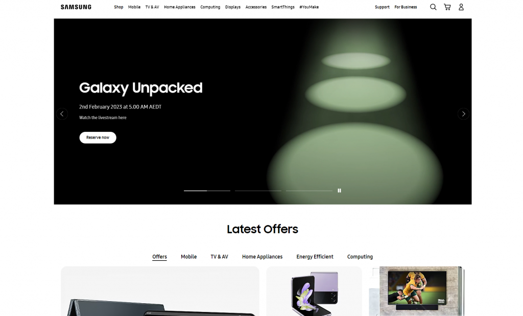
For example, check out the websites of technology giants such as Apple and Samsung. Their websites are filled with motion graphics such as short videos, GIFs, and varied visual cues that illicit visual enjoyment and provide users with all the information they’re looking for but in a pleasant manner instead of just a wall of text.
Web Design Trend #10: Cosmic & Dark UI ⚫
Dark UI has become more exciting and complex than just a dark mode. As a result, more and more brands are switching to a dark version of their main website or their app as the main one. It may be easier to catch and grab the user’s attention on a dark-mode website, especially if it has excellent animation and stunning visuals. It can create an excellent futuristic and sometimes even cosmic-looking vibe.
But, aside from a purely visual and aesthetic standpoint, there are several other reasons why dark UI has become a critical web design trend for 2023:
- It can reduce eye strain, especially in low-light conditions.
- It can save battery life on devices with OLED screens.
- It can create a visual hierarchy and focus the user’s attention on specific elements.
However, it’s also important to remember that some users prefer a light UI, so it’s a good idea to provide an option for users to switch between soft and dark modes.
Excited For The Next Generation Of Web Design? 🤩
In conclusion, web design is constantly evolving, and the trends for 2023 are shaping up to be even more exciting. As we head into this new year, we expect to see more focus on creating personalised and interactive user experiences.
From dynamic illustrations and micro-animations to immersive 3D and AR, these new design elements will engage users and enhance their overall experience on your website. Additionally, the responsive and mobile-friendly design will remain a top priority with the rise of mobile devices.
To stay ahead of the game, it’s essential to stay informed and test out these new trends on your website. By doing so, you’ll be able to provide your customers with an unparalleled experience and stand out in a crowded digital landscape.
So, get ready to take your web design to the next level in 2023 and beyond. Book a discovery call today to discover how we can help you implement these trends and other relevant modern technologies on your website to deliver an exceptional customer experience.
Topics
Published On
January 27, 2023

