Material Design 3 & Flutter: Designing, Developing, Migrating
Julian Wallis
10 min read
Material Design has been a popular design language for developing mobile and web applications since it was first introduced by Google in 2014. Its latest version, Material Design 3, is even more refined, versatile, and user-friendly.
On the other hand, Flutter is a popular cross-platform mobile development framework that allows developers to build high-quality, performant, visually appealing apps for Android, iOS, and other platforms.
This article explores how the framework’s intended migration to Material 3 will influence the designing of adaptive experiences on applications as well as the overall design, development and migration processes.
We will start by briefly discussing the basics of Material Design 3 and Flutter and then dive into best practices from design to deployment with Material 3.
What Is Material Design 3? 🎨
Material Design 3 is the latest version of Google’s design language. It builds on the principles and features of its predecessors but with a more refined and versatile approach. As a product of collaboration between Google designers and developers, it’s a freely available design system that aims to promote consistency and ease of use across digital platforms. Material Design 3 represents a significant advancement with a range of new features that foster personalised, adaptable, and expressive user experiences.
One of the standout features of Material 3 is its dynamic colour palette, which allows for a more nuanced and varied use of colour across different interfaces. In addition, the design system places a strong emphasis on accessibility, providing developers with the tools they need to ensure that their products can be used by the widest possible audience.
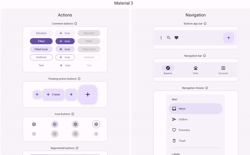
Material 3 also includes a number of foundational elements that make it well-suited for use on large screens, such as those found on desktop computers and tablets. Design tokens, which allow developers to share and reuse design elements easily, are another key system feature.
Material Design 3 introduces new features like spatial relationships, customising the app to a user’s needs, and more. The goal of Material Design 3 is to create a more natural and intuitive user experience.
To summarise, some of the key features and principles of Material Design 3 include:
- Spatial Relationships and Visual Hierarchy
- Dynamic colour theming
- Expressive and customisable typography
- Natural motion and animations
- Consistent and intuitive navigation
- Adaptive and responsive design
The benefits of Material Design 3 for app development include a more consistent and intuitive user experience, increased engagement and retention, improved accessibility, and enhanced brand recognition.
Flutter, Google’s popular UI toolkit for building natively compiled applications, is in the process of transitioning to Material 3. This will ensure that its users have access to the latest and most advanced design tools available. We’ll discuss more about this later in this article.
✅ Interesting Facts About Material 3
Material 3 (M3), also known as Material You, is the next generation of Material Design, and most Flutter widgets have already migrated to it. Still, you can also track this progress on the Material 3 Flutter GitHub project and the GitHub umbrella issue. To opt-in to Material 3, use the useMaterial3 flag, but be aware that your UI may be inconsistent until all of the toolkit and your code are migrated.
Once you are in, be sure to check out Affected widgets for the latest list of the framework’s widgets impacted by the useMaterial3 flag. While the vast majority of these widgets behave similarly in M2 and M3, some have substantially different behaviour in M3, and new widgets have been created. Ultimately, Material 3 will become the default look and feel of the Material library, with support for Material 2 eventually being removed according to the toolkit’s deprecation policy.
Basics Of The Flutter Framework 🦋

Flutter is an open-source mobile development framework created by Google. It allows developers to build high-quality, performant, and visually appealing apps for Android, iOS, and other platforms with a single codebase. The toolkit uses the Dart programming language, designed to be easy to learn and use for web and mobile development.
The framework has some incredible features that make application design and development much easier than it actually is. These features include:
- Hot Reload for faster development and testing
- Fast performance and smooth animations
- Widget-based architecture for reusable and customisable UI components
- Rich set of built-in widgets and libraries
- Access to native device features and APIs
- Strong community support
The latest iteration, Flutter 3.7, released at the beginning of the year, brought about some cool new features and updates, especially for Material 3 and enhancements for iOS. Some of the new features in Flutter 3.7 are:
- Improved Support for Material 3 following the migration of several intuitive design widgets such as – Badge, BottomAppBar, Checkbox, Divider, Menus and more.
- Menu bars and Cascading Menus in Material Design Menu
- Impeller Rendering Engine
- iOS Release Validation
- DevTools Updates
- Custom Context Menus
- Scrolling Improvements
- Internationalisation Tools & Documentations
- Text Magnifier
- Memory Management
- Removing Support For Legacy macOS Versions
Activating Material 3 In Flutter 💥
Flutter has received updates to support Material 3 since it was announced. These updates include new typography, shapes, elevation, updated widgets, and new M3 widgets. Most of the M3 components are already available in the toolkit, but there are a few widgets that are still in progress. You can keep track of their progress by following Material’s Flutter page.
At present, Material 3 changes are only available when you opt-in, which means you’ll need to use the useMaterial3 flag on ThemeData to enable Material 3 support.
However, this may change in the future, so it’s a good idea to check the Flutter website for updated documentation. To use Material 3 in Flutter instead of Material 2, specify the following:
theme: ThemeData(
useMaterial3: true,
),
What Does The Material Design 3 Update Mean For Flutter? 🕵
Material 3 updates brought revamped typography, an improved ColorScheme (including the ability to generate a full ColorScheme from a given seed colour), updated elevation, a beautiful Android 12 over scroll stretch effect, and a new ink ripple.
A bunch of Material widgets, such as AppBar, FloatingActionButton (FAB), ElevatedButton, OutlinedButton, IconButton, and Card, have been updated to support Material 3 design. There are also new Material 3 widgets, such as NavigationBar, NavigationDrawer, andSegmentedButton, some new M3-style buttons, such as FilledButton and FilledButton.tonal, and a whole lot more.
Suppose you simply migrate the Flutter starter app to Material 3. In that case, you’ll already notice some changes: The AppBar has no elevation or background colour, and the FAB has a rounded rectangular shape instead of the more familiar circular shape. That said, instead of going through the finer details of the update, let’s summarise the key changes in Material 3, and they are as follows.
🌈 Dynamic Colour
Dynamic colour has always been an important aspect of the world of design, especially with current web design trends. With Material Design 3, developers have access to various new improvements in terms of an enhanced colour palette. The new Material Design 3 brings with it a host of updates and changes aimed at enhancing the user experience.
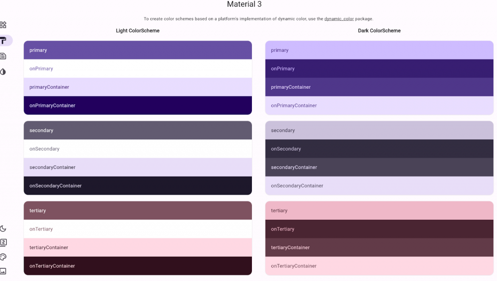
This revamped colour scheme allows for more fluid and responsive designs that can adapt to a wide range of devices and screen sizes. With a focus on accessibility and ease of use, Material Design 3 offers a unified and cohesive colour palette that can be customised to suit the needs of any project. From vibrant hues to subtle shades, these dynamic colours provide endless possibilities for creating beautiful, engaging user interfaces.
With Material Design 3, Flutter has truly set a new standard for modern app development.
🔡 Typography
Material 3 has simplified typography naming by dividing type scales into 5 primary groups – Display, Headline, Title, Body, and Label. This new naming convention provides an intuitive description of each group’s role, resulting in hassle-free use of varying sizes within a typography group.
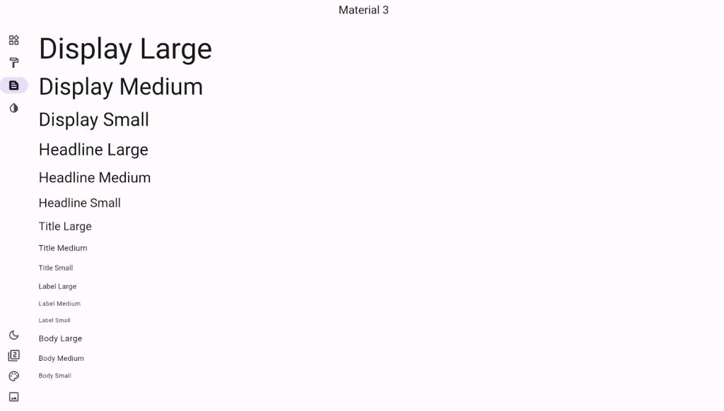
For instance, using BodyLarge, BodyMedium, and BodySmall instead of bodyText1, bodyText2, and caption makes implementing typography a breeze, especially for devices with varying screen sizes.
🏔️ Elevation
With each elevated component in Material 2, a shadow is automatically applied, scaling in size with the elevation. Now, Material 3 introduces a new surfaceTintColor colour property that can be applied to elevated components, enhancing their appearance and intensity based on their elevation value. Flutter users will be thrilled to know this property is added to all elevated widgets, along with the elevation and shadow properties.
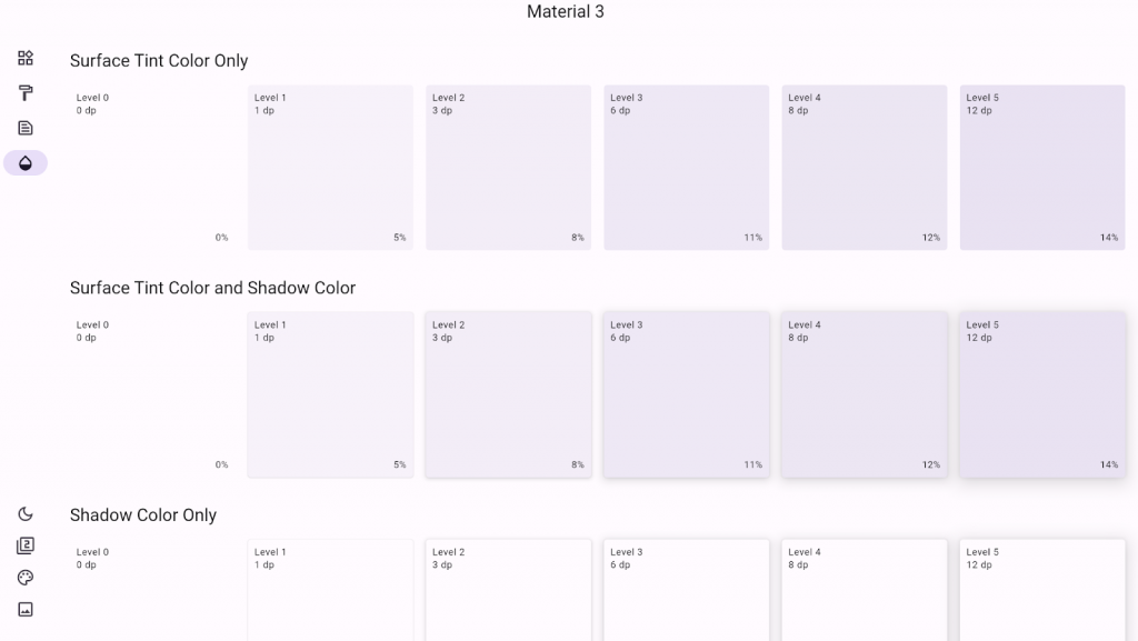
💠 Shapes
Lastly, Material 3 provides an expanded selection of shapes, including squared, rounded, and rounded rectangular, to help improve your UI game. Plus, enjoy a sleek update to the FAB (previously circled), now featuring a modern rounded rectangular shape, while material buttons have transformed into pill-shaped beauties. Even popular widgets like Card, Dialog, and BottomSheet get more rounded in M3.
How Can You Make The Most Of The New Material 3 Features In Flutter? 🤷♂️
Flutter Material 3 can help businesses create visually appealing, user-friendly, and cross-platform mobile apps quickly and efficiently, which can ultimately lead to better user engagement and increased revenue. But that’s just scratching the surface, as this update can greatly benefit your app design and development process.
Here are some of the biggest advantages of Flutter Material 3.
⚡ Faster Development
With Flutter Material 3, developers can create visually appealing and consistent UIs for their mobile apps quickly and efficiently, reducing development time and cost.
🙋 Improved User Experience
It provides a set of pre-built UI widgets that follow Google’s design guidelines, making it easy to create a user-friendly and intuitive interface for your mobile app.
📲 Cross-Platform Support
It’s a cross-platform framework that allows developers to create mobile apps for iOS and Android platforms using a single codebase, saving time and effort in development.
🛠️ Increased Customisation
It also has a lot of customisation options for UI widgets, allowing businesses to tailor the user interface to their brand’s visual identity.
🤝 Strong Community Support
It has a large and active community of developers, making it easier for businesses to find resources, support, and solutions to any development issues.
Conclusion: Material 3 Design & Flutter 🧐
Flutter Material 3 is a potent tool that will help you streamline the entire design to deployment methodology for your mobile apps. Following best practices for designing, developing, and migrating apps with this technology, you can create high-quality, performant, visually appealing apps that engage and delight your users.
As Material Design and Flutter evolve, we can expect to see even more powerful features and capabilities that make app development faster, easier, and more enjoyable. By staying up-to-date with the latest trends and best practices in app development, you can ensure that your apps are always at the cutting edge.
With the migration of Flutter to Material 3, developers are in for an exciting redesign journey. Armed with best practices and adaptability from the get-go, user experiences will be much more contextually aware and interactive. This provides new opportunities for developers to create meaningful applications that build on the strengths of Material Design 3 and Flutter as a combined value proposition.
If you’re ready to revamp your existing app experience or create a new one, book a discovery call so that we can help navigate your project’s development process with confidence. In the meantime, take some time to explore the power of both Flutter and Material 3 further – there’s a lot of potential here!
Topics
Published On
May 12, 2023

